
|
|
Exhibit 1: Photo healing
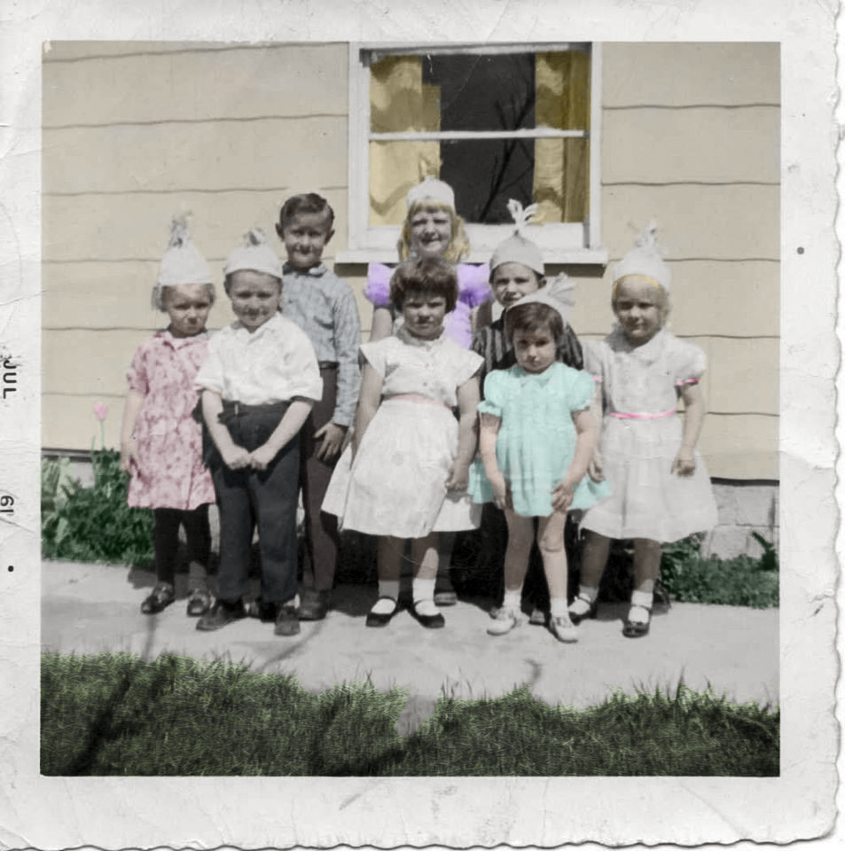
This exhibit is picture owned by my cousin, she is in the picture above attending my Dad's birthday. Originally it was an old black and white photo with bends and creases, as well as just wear and tear. I healed the image some with the spot healing, and healing brushes as well as the clone stamp. I decided to leave much of the "rough" look to the image because I wanted to preserve that old time feel to the image. I then added colors by researching colors of clothing to house in 1961, which is the year stamped on the left of the image. Using different blending modes I added these colors to the photo. Finally I added an image of grass in color blending mode to the grass.
|
Photoshop Skills Used:
|
Design Thoughts:
|
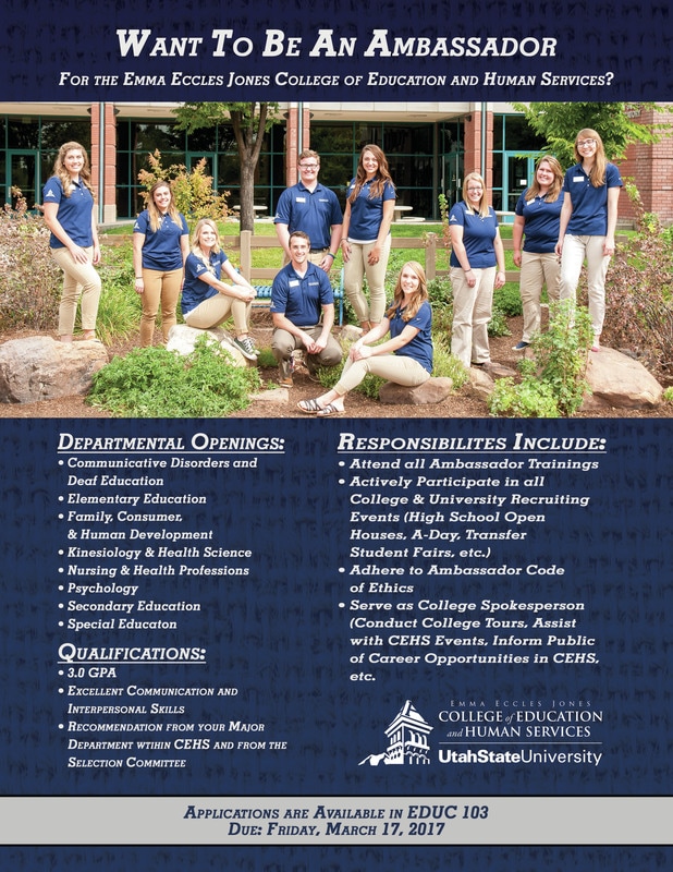
Exhibit 2: USU Ambassadors Flyer
I was given the opportunity to design a flyer for the Emma Eccles Jones College of Education and Human Services. I was told they wanted to keep the same feel, and information as the old flyer, but wanted it updated. I began by organizing the information based on similarities and importance. I decided to have one large image that would catch attention rather than two small ones as they had on the original. I decided to get rid of all the original boxes and differing colors, they seemed to distract from the message. I chose colors based on USU's colors, added a gradient and a texture, and then started to organize. The following are the results.
|
Photoshop Skills Used:
|
Design Thoughts:
|
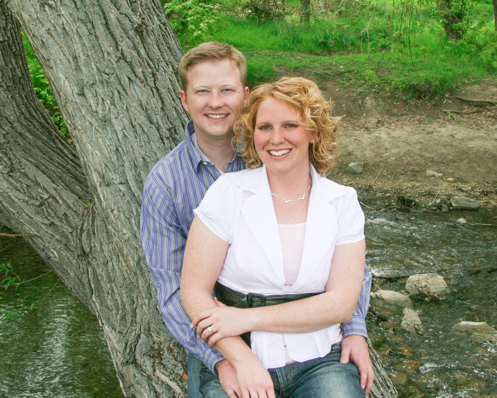
Exhibit 3: The Engagements
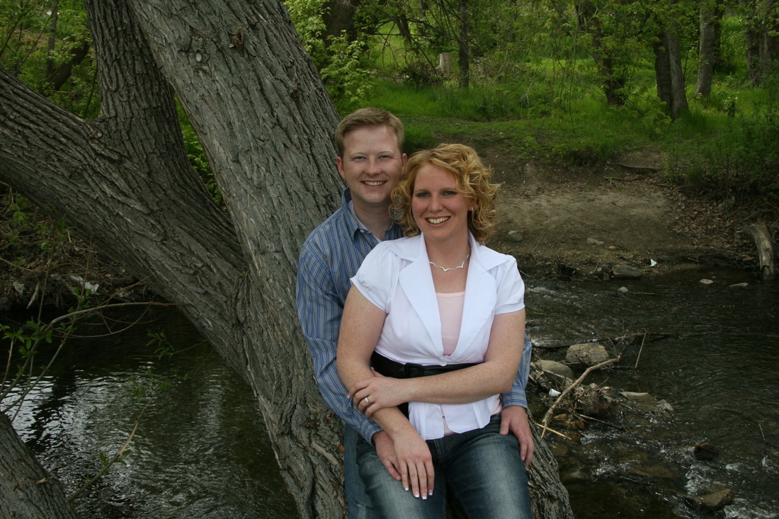
Original
|
Enhanced
|
This week I took on a project that I have had on my list for about ten years. I took one of my engagement pictures and enhanced it a little bit. I first lightened the whole image as it seemed a little dark using the camera raw filter. Next cropped it up to focus on my wife and me. I removed the debris and litter from the background as well as a tree stump using the stamp tool and healing brushes. I also whitened our teeth a bit using a curves adjustment. Finally I Used frequency separation to remove blemishes while not making us look plastic. This exhibit was one of love as she has always wanted these things fixed up. I feel this image is far more presentable without sacrificing true life.
|
Photoshop Skills Used:
|
Design Thoughts:
|
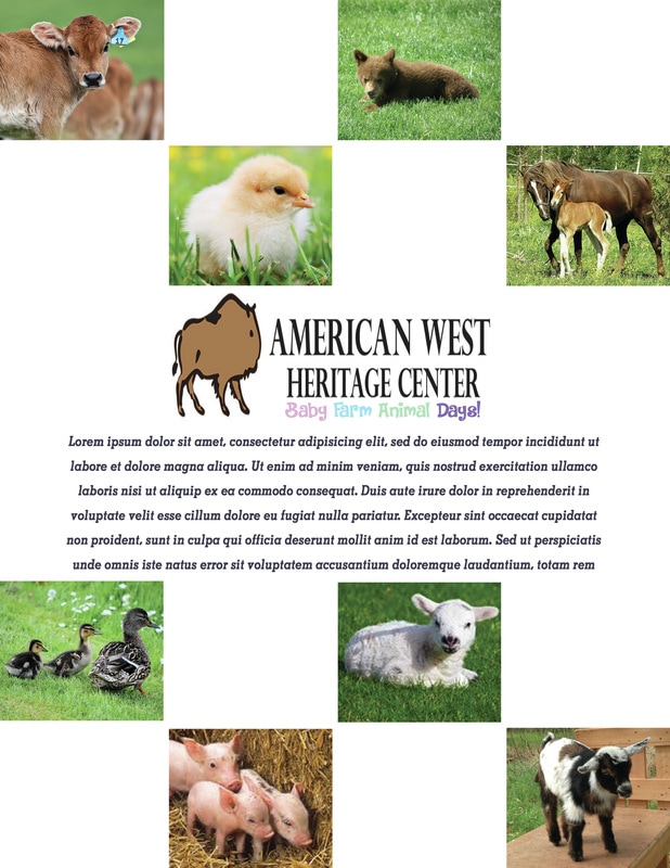
Exhibit 4: Baby Farm Days Layout
|
I was asked to a newsletter layout and since my wife creates newsletter I new who I could turn to for a project. The image above is a layout for her newsletter that will also advertise a program they will be having at her work. I created a four column, six row grid for the layout and added various images of animals using this grid. I started with the cow in the top right to try to make the flow of the page go from top to bottom, left to right. Filling the top left and bottom right corners will lend to this. In the middle I placed the logo of the company and added a subtitle to it to announce the activity that will be attended. I used a font that was "baby" appropriate and filled it with traditional baby colors. I also added a filler box for text as a description of the activity will need to be added, but they will fill in that information.
I used images from the following resources: piglets: http://www.freestockphotos.biz/stockphoto/10110 lamb: http://www.publicdomainpictures.net/view-image.php?image=13533&picture=baby-lamb kid: https://www.flickr.com/photos/wellingtonfamilyfarm/8638733887 calf: https://commons.wikimedia.org/wiki/File:Calf_with_eartag.jpg foal: https://commons.wikimedia.org/wiki/File:Finnhorse_mare_with_foal.jpg chick: https://www.pexels.com/search/chick/ duckling: http://www.publicdomainpictures.net/hledej.php?hleda=ducklings bear cub: https://www.flickr.com/photos/jamiedfw/496956892 |
|
Photoshop Skills Used:
Setting up Grids Masks Texts |
Design Thoughts:
|
Exhibit 4: Valentine's Day Card
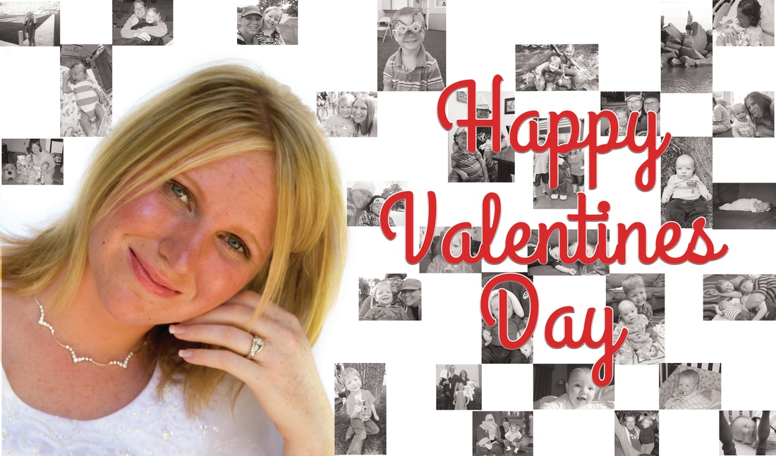
Since it is Valentines Day I decided to create a card for my wife. I found one of her bridal pictures and cropped her out of it using a mask and refining the edge. I then created rows to add quite a few snapshots of times we have had together during our marriage, many of them have to do with our family! I turned those images gray to try do give them a "memory" effect. I then added the text on top. I added styling to the the text, at first I tried a drop shadow, but finally settled in on using a bevel & emboss, stroke, and inner glow stylings instead. This created a much more personalized, and hopefully much more appreciated card.
|
Photoshop Skills Used:
|
Design Thoughts:
|
Exhibit 5: Infographic - Travel Safety Tips
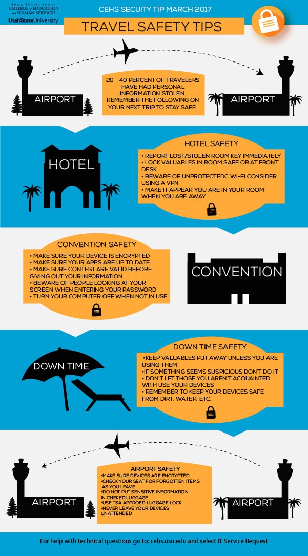
This was a fun project. I designed an infographic that gives tips for safety on every aspect of one's trip. I tried to make it like an itinerary and placed tips in each bubble that corresponds with that part of a trip. I created all the graphics mostly using shapes and pen tools. I added triangles at the bottom of each section to help increase the flow of the project. This was created right before many conventions are attended by many of the faculty at work in order to provide a little "just in time" training. I also decided to do brighter and light colors to try to convey a warmer, summer type of feel to my infographic.
|
Photoshop Skills:
|
Design Thoughts:
|
Exhibit 6: Shapes

Photoshop Skills:
Exhibit 7: Black & White |
This week we were given a challenge to create something with shapes and so I did. using the shape of a diamond I created my initials JlC. Once I had that done I did a step and repeat to create an even larger diamond with my initials turning 90 degrees from the previous shape, rotated clockwise. I then decided to add a dark blue color to show steadiness and calmness. Two qualities I hope people find in my work. Finally I turned it into a smart object and added a bevel & emboss effect to it. All in all I think it is a pretty cool little logo for myself, all using shapes. I have added it to the header of my website.
Design Thoughts:
|
|
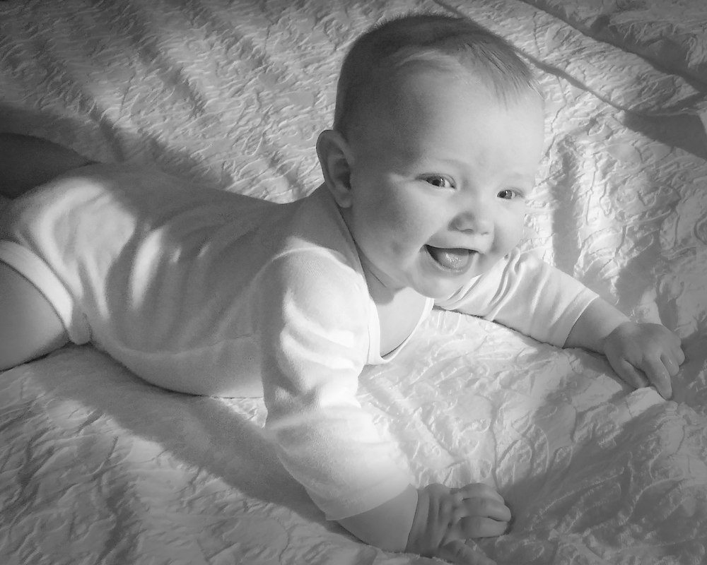
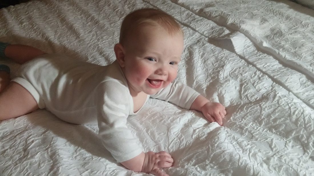
I have been trying to find a picture I thought would be better as a black and white image and came across this one of my son. I have always liked this image, but thought it was a little bland so I decided to give it a shot. I first took the image into camera raw and warmed it, brightened it, increased contrast by turning up the reds and oranges, I then converted it to grayscale, and reduced the haze. Back in Photoshop I cropped it to focus on my son and it seemed pretty good, but the contrast could be greater to create more interest. So I added a new layer with a dark gray fill turned to 50% opacity. I grabbed a soft large brush and brushed a mask with white paint focusing on my son's face and painted in a vignette. This created focus and a brightness, which I think displays this little guy's personality. The original is to the right for your comparison.
|
|
|
Photoshop Skills:
|
Design Thoughts:
|
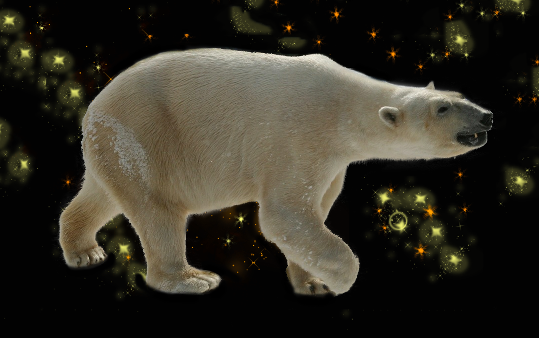
Exhibit 8: Cutting a polar bear
|
I wanted to practice my selection skills and have a little fun this week. So I found this image of a polar bear who was on a white background and removed him from that background and put him on this black one (with some stars for fun)! I began by using the calculations dialog to multiply one of the channels by itself, I think it was the red. I had to work with the inverse of the image in order to be able to make a selection in the alpha channel since it was so difficult selecting white from a background of white. Using some soft brush work in overlay and multiply blending modes, I was able to come up with a pretty good selection, and pulled this polar bear from it's habitat and suspend him in space! The bear hasn't even realized what is going on yet as he still has some of the snow still on him from his Arctic home!
|
|
Photoshop Skills:
|
Design Thoughts:
|
Exhibit 9: 3D Imaging
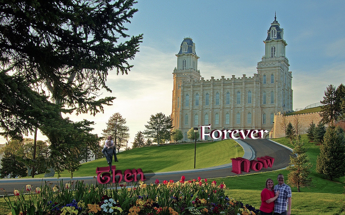
This was a fun project! I created some 3d text and added it to this image I have of the Manti, Utah LDS Temple, where my wife and I were married. Since the road guides the eye up to the focal point of the temple I decided to use the same method to share my message. I took a picture of My wife and me from when we were dating, removed us from the background and put us on the hill. I added the word "Then" as a reminder of where we have come from and put it towards the beginning of the road. Since the image already had shadows I tried to darken the text and match the shadow with those already in the image. When following the road we come to the present and so I put an image below the road next to the word "Now" I had to split the extrusion this time to try to get the effect of climbing a hill (which I thought a great metaphor for getting through life). Then when reaching the top of the hill I put the word "Forever" I changed the front color of the text to try to make it stand out from the others and with a high feathered brush masked out some of the bottom of the text (I also removed a few lights.) The forever is the goal I have for my marriage with my wife and so I wanted it to be the final destination, stand out the most, and be a focal point.
|
Photoshop Skills:
|
Design Thoughts:
|
Exhibit 10: Cinemagraph
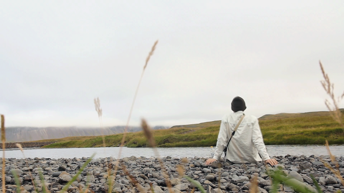
This was something new for me to try and I thought it was a lot of fun. I created a cinemagraph from this photo taken from videos.pexels.com and created this gif from it. After duplicating the video, fading it into itself, and looping the video I had a seamless looping video. I was then able to add a still image on top of these videos and add a layer mask to it to show only the moving water ripples you see the man looking at.
|
Photoshop Skills:
|
Design Thoughts:
|
