
|
|
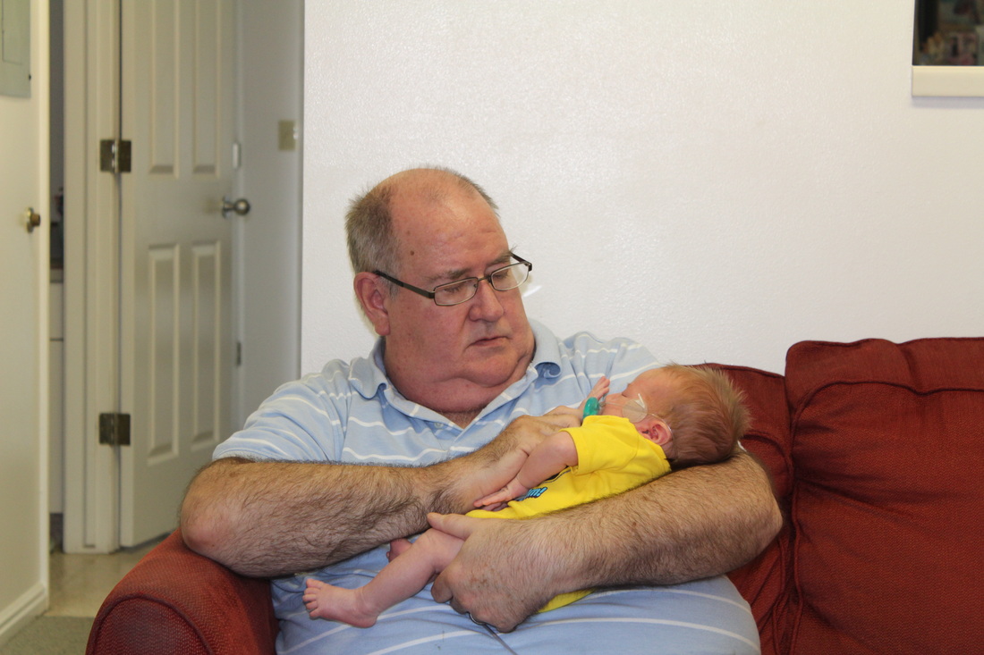
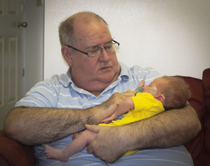
Exhibit 1: Before and After Image
|
|
I was asked to edit a photo that was important to me and boy is this one ever. This is both the first time my dad saw his latest grandson, and the last time I saw my dad. It made this assignment difficult and very valuable. I began by cropping the image to fill the frame with what was important, my dad and my son. I then adjusted the the highs, lows, and mids in the Basics pane. I then adjusted the tones and hsl/grayscale, next I moved on to noise reduction and sharpening. I smoothed out a glare that is on the wall from Dad's glasses and finally added a bit of a vignette.
|
Photoshop Skills:
|
Design Thoughts:
|
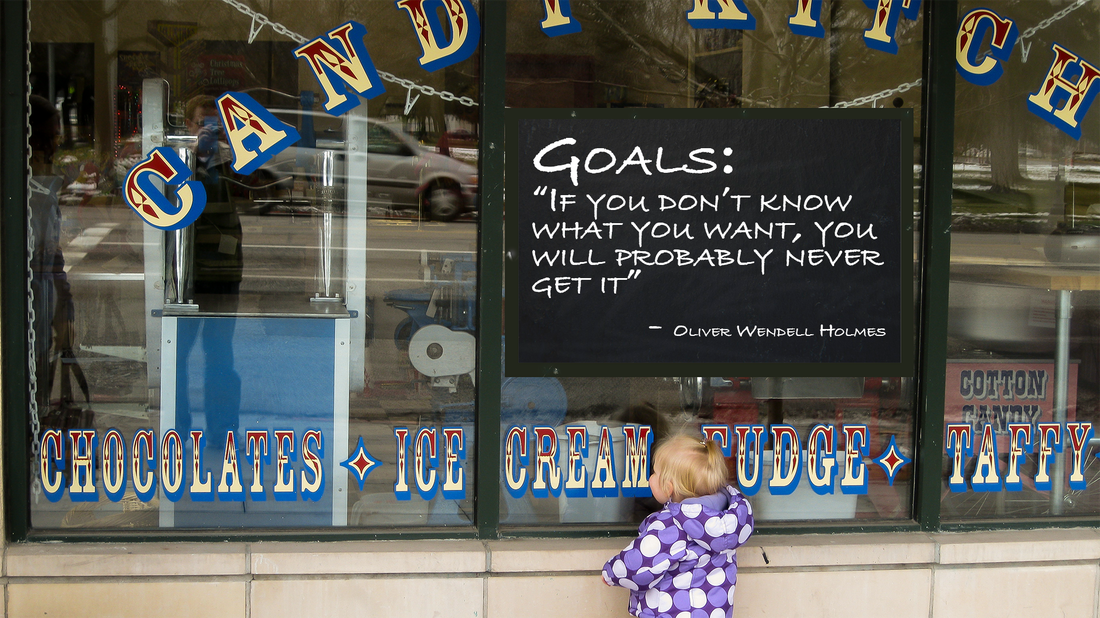
Exhibit 2: USU Stars Digital Display
Photoshop Skills:
|
Trying to come up with the idea for this image may have been one of the more creative parts of this assignment. I found the phrase from Oliver Wendell Holmes and it brought this picture of my daughter staring in the candy shop window to mind. After doing some adjustments in camera raw and adjusting the image size to meet requirements I added the faux chalkboard so I could get some contrast with the words. I used this font to stay with a childlike theme, and tried to offset the picture as much as would allow.
Design Thoughts:
|
Exhibit 3: Housing Flyer
I was given a fun opportunity to recreate a trunk or treat carnival flyer for USU housing (Family and Single Area) The original flyer was really busy and had a lot of information on it. It was difficult but by dividing the information up I was able to calm things down a bit. I tried to stay true to the original design, but improve on it.
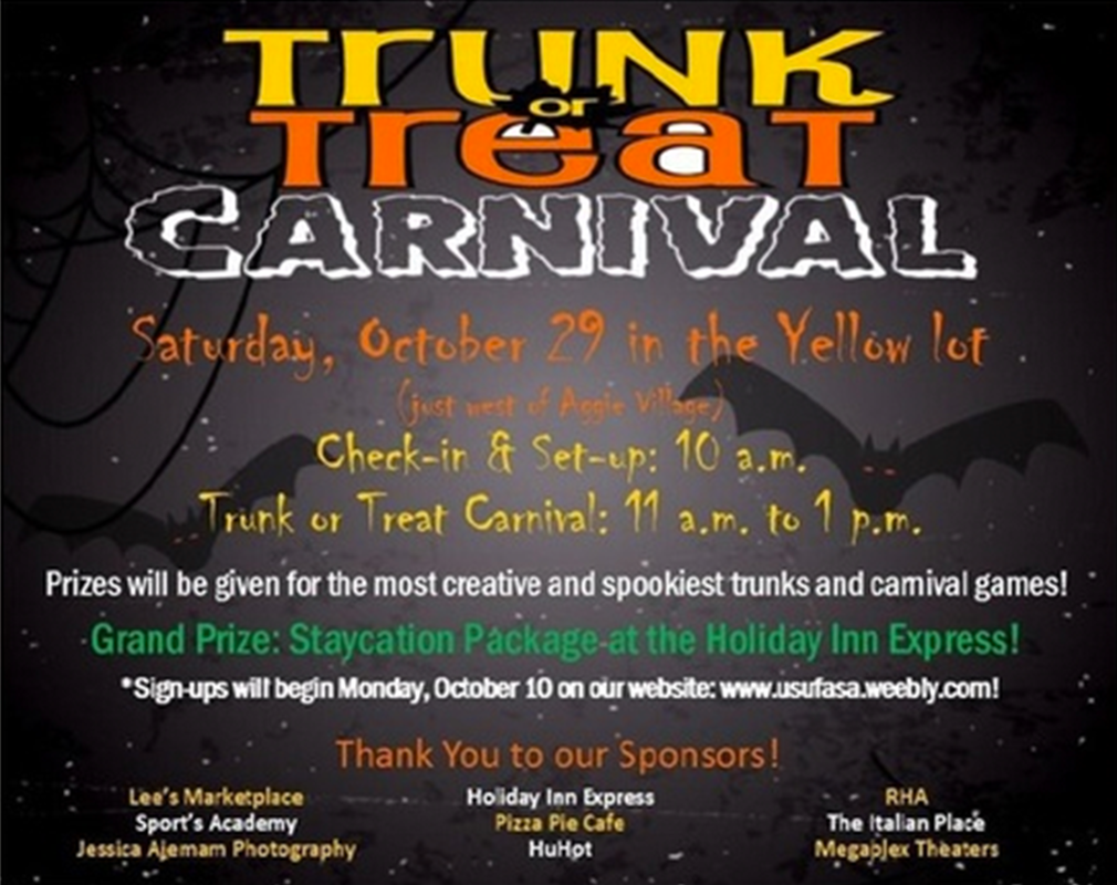
Original
|
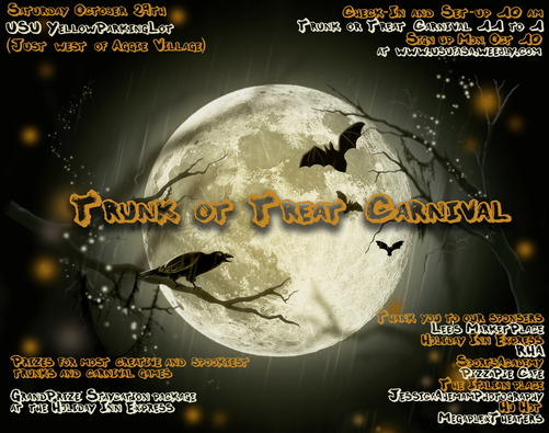
Updted Version
|
|
Photoshop Skills:
|
Design Thoughts:
|
Exhibit 4: Door Flyer
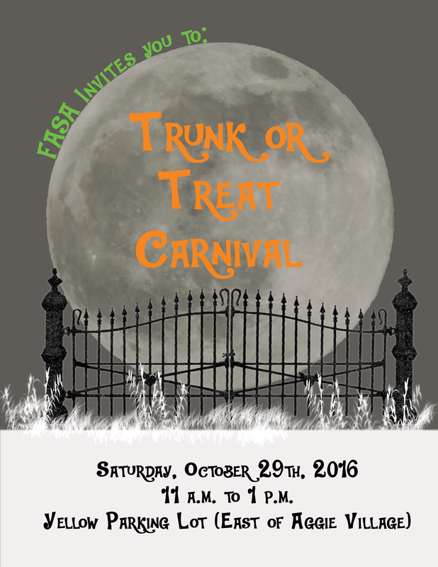
In addition to the previous flyer I was asked to create another flyer, one that could be printed and hung on the doors of residents. I kept with the moon them to try to have some consistency between flyers. I started with a basic gray background, and then found a moon to add as the next layer. I added some text following the path of the moon, as well as some on the moon in bright halloween colors that make them pop and grab the eye. I had to download a font to get the look that was wanted. I then threw in a wrought iron gate which framed the moon nicely. I used four different brushes to add grass in white to surround the gate. The whites and grays in the grass made a good transition to the text area located at the bottom of the screen.
|
Photoshop Skills:
|
Design Thoughts:
|
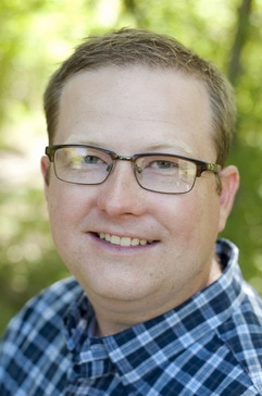
Exhibit 5: Business Card
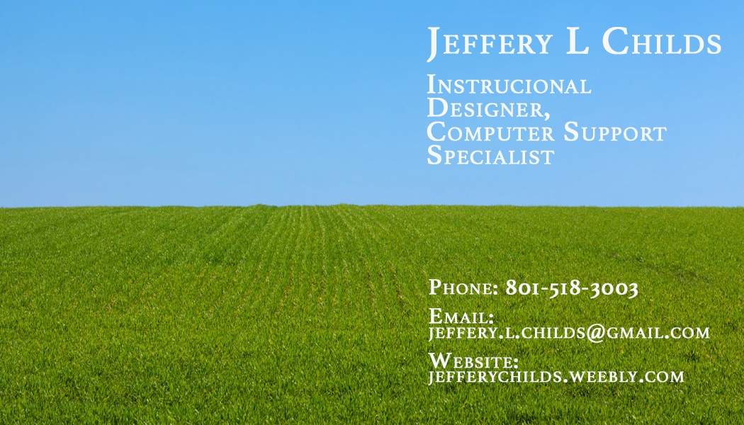
Front
|

Back
|
We were challenged to create a unique, attractive, and professional business card. After many attempts of trying to find an image that portrayed what an instructional designer was I decided to use this image. Something that is clean and refreshreshing for two reasons: 1 Instructional design can give order to chaos, and two I have a peaceful attitude towards life. I made sure to group on the front my name and titles, as well as my contact information. On the back I added my signature to add a personal touch. Using artboards in photoshop made this not only a faster process, but much, much less complicated.
|
Photoshop Skills:
|
Design Thoughts:
|
Exhibit 6: Retouching a personal photo
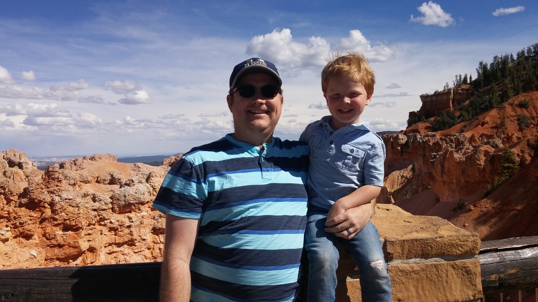
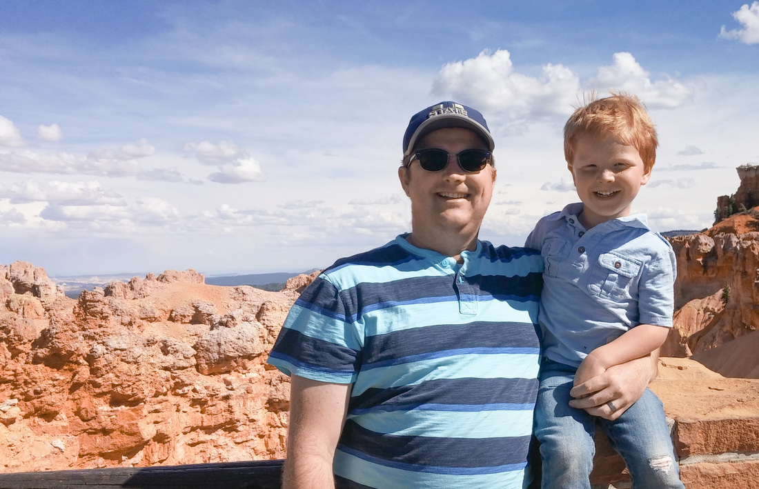
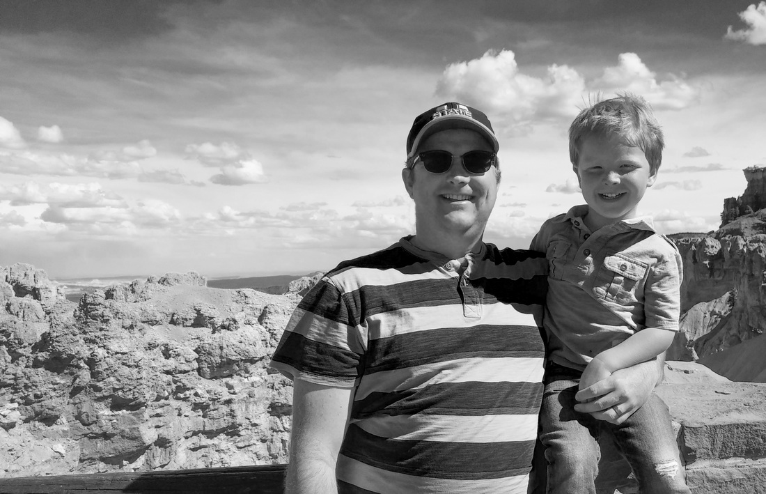
This is a picture that I love from a recent trip I took with my family to Bryce Canyon, UT. I especially love this photo because you can see the happiness of my son just bursting out. The Image on the far left is the original. I took this image into Camera Raw and lightened the shadows quite a bit to be able to see both of our faces better. I then increased the red, yellows, and blues. Once done I cropped the picture as we were so centered it was a fairly boring picture. Next I tried to using the liquify and whitening our teeth a little bit, as I wanted to keep the photo real and I didn't feel the teeth where a distraction. I also retouched the skin on my face, as I forgot my razor on this trip and I prefer to be clean shaven so I selected my beared area of my face and both blured and added noise back into my face. Finally I used the healing brush and stamp to fix a few blemishes and hair that was sticking out. After inpecting the color version I wanted to try it in black and white and really liked that as well, so I decided to keep and post both!
|
Photoshop Skills:
|
Design Thoughts:
|
Exhibit 7: Merging Photos
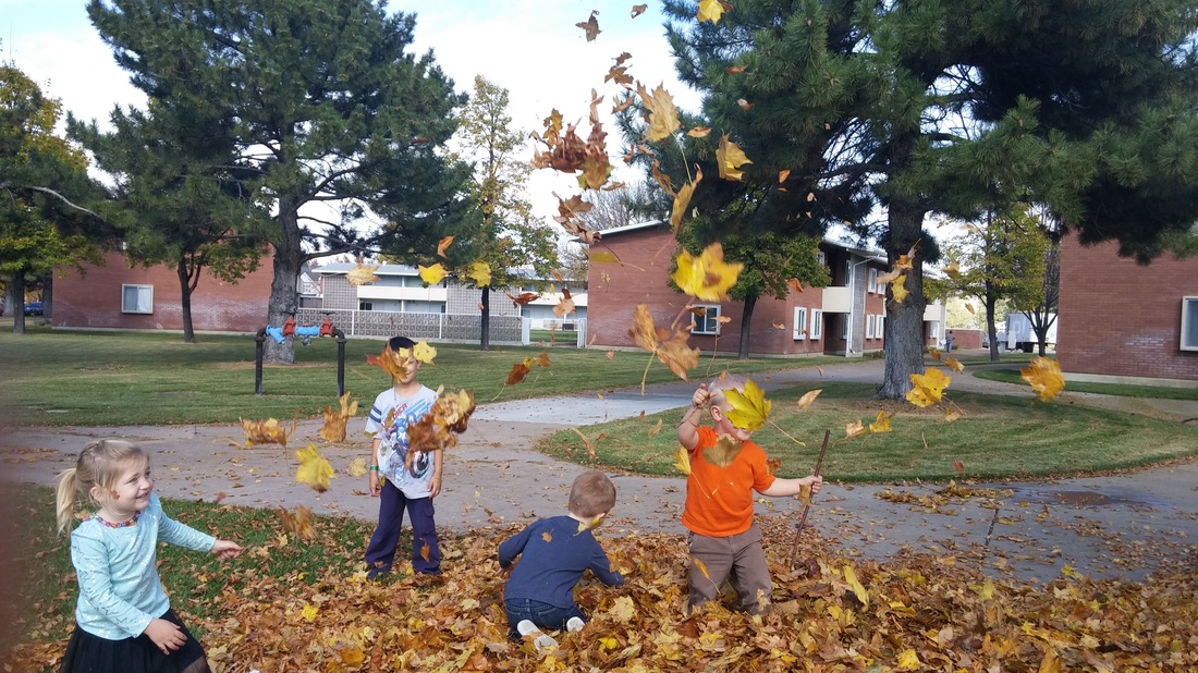
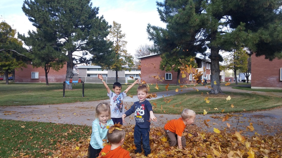
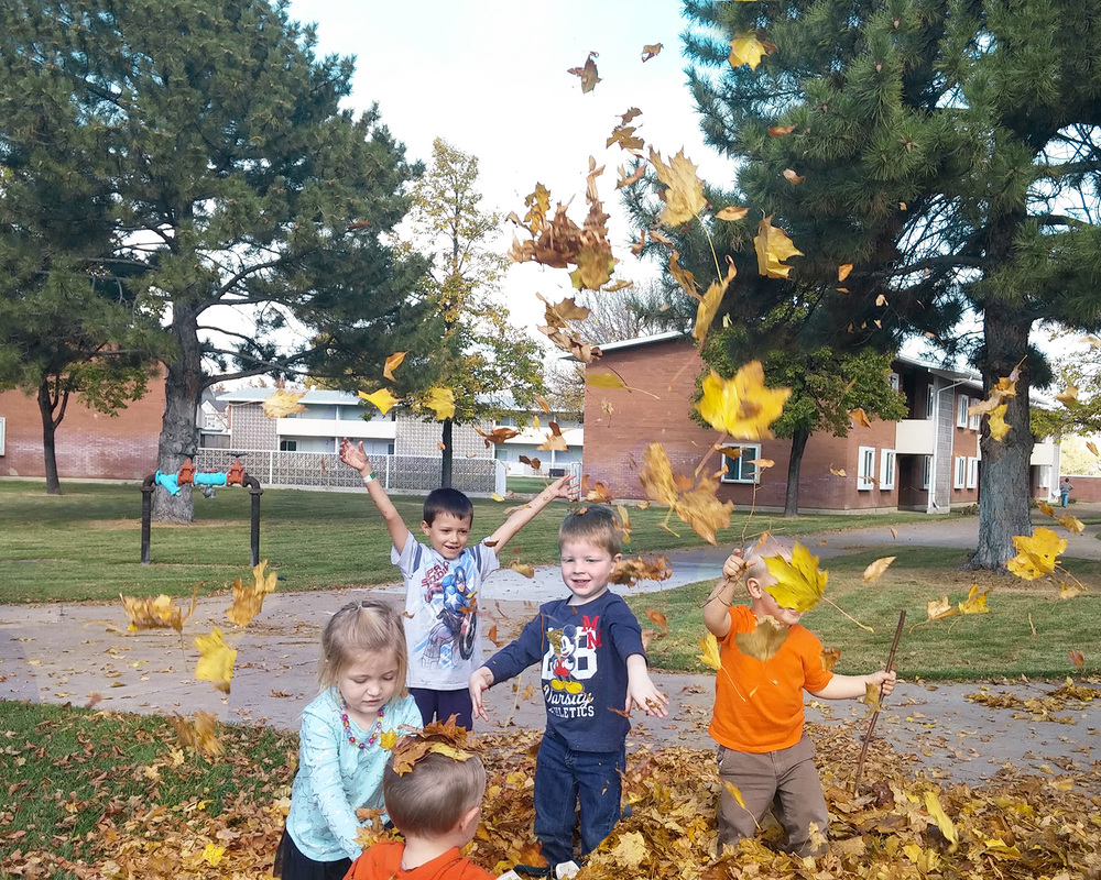
This was a fun project. My wife took these pictures of some of the neighborhood kids playing in the leaves that had been raked up. I thought that the leaves in the first image were fun, but I liked the kids in the center image better. So I opened each image in seperate layers. I then had to rasterize one of them as it was a smart object. Then I was able to use photoshops auto-align feature to line the pictures up. I cropped the image and filled in the empty spaces using photoshops content awareness. I then was able to use a mask with a feathered brush to show the kids in the second image on the first image, but still leave the leaves. Then I used the stamping tool to finish up a few problem spots. Finally, I enhanced the colors especially adding more yellow in the leaves. The final project can be seen on the right.
|
Photoshop Skills:
|
Design Thoughts:
|
Exhibit 8: Creating a Flow Chart

|
I was asked to create a flow chart for USU's Empowering Teaching Excellence 10 Program. A program that focuses on professional development for instructors throughout the university. At first I was just going to jump on Word and create a quick flowchart and then I decided that I could do much better than that. So I took a copy of the 10 from the ETE 10 logo and made the chart work with that logo. My original was modified a little by their team (I had a purple background and white 1 and 0, they filled it with the triangles that they have started putting on all of their products.) This helped match this chart to their brand a little better. I knew I had done a good job when I presented the product to the lead Instructional Designer for ETE 10 and he just nodded his head and smiled. For more information on ETE 10 go to: empowerteaching.usu.edu/ETE10. My original can be seen to the right
|
|
|
Photoshop Skills
|
Design Considerations
|
Exhibit 9: ETE 10 Badges


I have been using photoshop to edit existing badges for the ETE 10 program mentioned in the earlier post. These were not initially created by me, but I have been updating them to use for the badges awarded in 2017. I have had to mask out old portions of the badges, and use the stamp tool to fill background in that matches the rest of the background. I have also had add additional text and symbols. I created additional symbols in Illustrator and then added them in using photoshop.
|
Photoshop Skills:
|
Design Thoughts:
|
